Designing Accessible Widgets
As a widget developer, it’s important to consider the needs of users who may need additional accommodations due to motor or sensory impairments. These accessibility accommodations should be incorporated as part of your initial design of a widget, as they can be much more difficult to build later on.
When we talk about accessibility, we’re primarily concerned with two forms of accommodations:
- Keyboard accessibility, where the widget is fully functional using exclusively keyboard controls.
- Screenreader accessibility, where the widget is functional when used with a screenreader. These are either first-party programs (like VoiceOver for Mac OS) or third-party programs (like JAWS or NVDA for Windows machines) that allow users with visual impairments to perceive the contents of an application or webpage.
It’s important to note that while most of the widgets in the core Materia catalog are fully keyboard and screenreader accessible, these distinctions aren’t binary; just because a user can use a keyboard to interact with your widget, doesn’t mean the widget is fully designed for keyboard control. Ideally, we aim for the latter. Screenreader accessibility can be even more nuanced due to differences between the major screenreader applications, much like the subtle differences between major browsers we must consider as developers.
Lastly, despite our lofty aspirations, not every widget can be made fully accessible, due to the nature of the interaction being asked of the user. For example, Word Search may be of some pedagogical benefit to sighted users, but the nature of Word Search means it would not translate into an effective or enjoyable experience with screenreaders. In such cases, it’s important to be up-front with users about such limitations, so instructors and stakeholders can plan appropriately.
Accessibility Metadata
The widget’s install.yaml can contain metadata to communicate the accessibility status of your widget. While not required, it is highly recommended that you include these values. They are used to populate UI elements in the Catalog and Detail pages.
Implementation Considerations
UCF is obligated to ensure that all digital course content abides by the WCAG 2.0 standard, which serves as a blueprint for many of the considerations outlined below. However, in many cases, widgets operate outside of the context of a normal web document; as such, we’ve outlined best practices to follow when creating highly interactive interfaces.
Keyboard Accessibility Guidelines
1. All inputs are part of the tab tree
By default, keyboard navigation makes use of tab and shift+tab to navigate forwards and backwards through the tab tree. The tab tree consists of every focusable element on the web page. Generally (though not always), these focusable elements are controls the user can interact with: buttons, text fields, text inputs, checkboxes, as well as more complex forms of input like combo boxes and drop-down menus.
2. Non-interactive elements are not part of the tab tree (with some caveats)
Non-interactive elements do not belong in the tab tree, by default. Some exceptions to this rule are described in the screenreader section below. Sighted users generally do not need to interact with static page content via the keyboard, and screenreader users have access to additional controls to navigate static page content.
3. Ensure all focusable elements have visual feedback
A sighted user should always be able to distinguish where the keyboard’s cursor is currently located, based on the currently focused input element. This style should complement existing styles such as :hover and :active.
4. Keyboard navigation uses standard controls
Users shouldn’t need custom controls to naviate your widget under most circumstances, and as such, you should not require users to conform to different control schemes when the default navigation controls would suffice. These controls include tab and shift+tab for input selection, arrow keys for selection within elements such as drop-down menus, enter or space to select an input (analogous to clicking), and escape to cancel or close.
5. Custom navigation and hotkeys are explained
Some interactions may require custom navigation controls despite the previous consideration. This may be because the default control scheme is inadequate, or control options may only be available when a certain item is focused. In such sitations, it is appropriate to implement custom controls, with several additional considerations:
- Custom controls should supplement default controls whenever possible.
- Avoid reassigning commonly used navigation controls to perform tasks that are unrelated.
- Custom controls, when available, should be communicated to the user. This information can be conveyed in the tutorial dialog (if present), a dedicated dialog for keyboard instructions, or contextually appropriate tooltips, popups, or toasts. These instructions should not be temporary, and should be able to be revisited if desired.
Screenreader Accessibility Guidelines
1. Avoid designing interactions that are irrelevant or inappropriate for screenreader users
It’s important to remember that screenreader users are experiencing a fundamentally different version of your application than sighted users. Relationships, hierarchies, and behaviors that are established visually are not available to screenreaders unless they are designed to be. Most importantly, some interactions that make sense for sighted users may not make sense, or be appropriate, for non-sighted users.
For example, Sort It Out involves an assortment of items cluttered on the screen above a series of folders, which represent categories. Users are tasked with sorting each item into its appropriate category. The relationship between items is fundamentally different for sighted and non-sighted users:
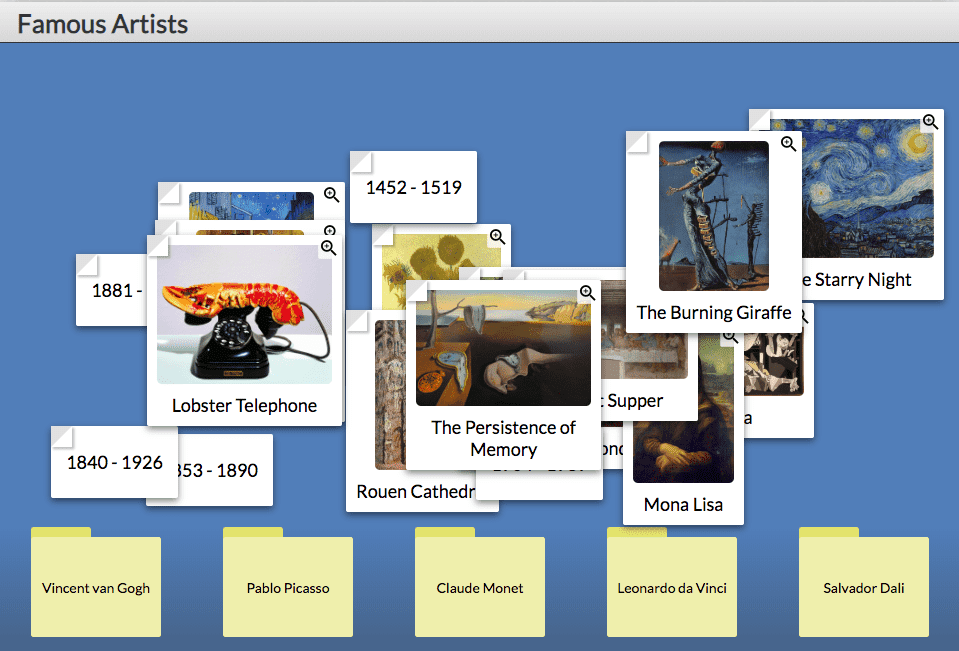
- Sighted users see the items as an unordered pile, and the folders as a separate set of elements on the page. There is an implicit understanding that items must be dragged into the corresponding folders to categorize them.
- Non-sighted users perceive the items as an unordered list when described by a screenreader. There is no non-sighted analog to dragging and dropping: rather, screenreader users make use of additional key controls to cycle between potential categories that the item belongs to. When the appropriate category is selected, they perform an additional keyboard input to confirm the choice.
2. Use semantic DOM elements when appropriate
Semantic DOM elements are elements that provide implicit meaning to what’s being rendered to the page. These might include elements such as:
<header />for a banner or header element.<menu />for an element analogous to an unordered list, but serving an implicit purpose as a navigation menu.<code />for an element that displays its contents as a snippet of computer code.
When possible, make use of semantic elements instead of generic elements like <div /> or <span />. There are quite a few - probably more than you remember!
3. Use appropriate ARIA roles when semantic elements are unavailable
ARIA roles should be considered second to semantic elements, when possible. However, ARIA roles and attributes can help you provide additional context to elements when read by a screenreader. Roles allow you to specify the semantic purpose of an otherwise generic element.
4. Use ARIA attributes to provide context to controls when necessary
Attributes are another component of ARIA that allow you to enhance the contextual data about certain elements in your widget. For example, aria-label provides a string label for an element that will be dictated by the screenreader when the screenreader cursor selects it. Similarly, you can make use of aria-labelledby and aria-describedby to provide additional explanatory text that may or may not be visible to sighted users, but is necessary for screenreader users to fully comprehend the state of the widget or the specific element selected.
5. Ensure tab navigation flows appropriately, and avoid tabindex values > 0
While screenreader users have several methods available to traverse the DOM, tab navigation remains one of the principle means of quickly moving around a page. It’s important to ensure that the tab sequence is intuitive and natural. By default, interactive elements are given a tab index of 0, and the browser will generate a tab sequence based on the rendered order of the elements on the page. While it is possible to override this tab sequence by using the tabindex attribute, it is not recommended. When possible, do not create a fixed tab sequence by using multiple elements with tabindex values > 0.
6. Use live regions to convey state changes based on interactions
ARIA live regions are critical to convey state information in a rich web application like most Materia widgets. Live regions are dictated by the screenreader when their content changes, with priority determined by the value of aria-live attribute. For most cases, you should make use of aria-live="polite", which conveys state information after the screenreader has completed its current dictation. aria-live="assertive" is appropriate for events of critical importance, such as an error or a very important game state change.
Some occasions to make use of a live region include:
- The user has been transitioned to a new question or a new screen.
- The user has submitted an answer choice.
- Focus has been updated programmatically based on an interaction.
- The widget has been completed and is ready for submission.
Updating a live region is as simple as changing the text contents of the element associated with the live region:
<span id='assistive-notification' aria-live='polite' />
In javascript:
    const element = document.getElementById('assistive-notification')
    element.innerHTML = 'This text will be read by the screenreader.'
Note that the DOM rendering methods used by javascript frameworks may create issues with live regions behaving as expected. You may need to manipulate the DOM element directly, instead of relying on abstractions provided by frameworks like Angular and React.
7. When breaking navigation conventions, ensure controls are explained
Much like the associated rule for keyboard navigation, it’s critical to communicate control schemes to the screenreader, whether they are additional shortcuts or changes to default controls. These include letter hotkeys, arrow keys, modifier keys, or the space, enter, or tab key.
Consider the scope of your keyboard controls, as well. Should they be active at all times, no matter where the keyboard cursor is located, or should they kick in only once a particular element is focused? For example, if your widget includes a “game board” that requires custom navigation, your keyboard controls may only be needed when the game board is focused. In such cases, it may be appropriate to provide a aria-labelledby or aria-describedby attribute on the game board element to provide control scheme instructions.
8. Avoid tab traps
A tab trap occurs when the keyboard cursor is “trapped” by overrides to the tab tree that prevent a user from leaving the document. It’s therefore critical to ensure that custom tab index values, or overrides to the tab key behavior, take tab traps into account and allow for the associated elements to be defocused. Users should be able to enter and exit your widget, and its component elements, freely.
9. Use proper markup when implementing dialogs and modals
Modals and dialogs interrupt the state of an application with information and potentially a request to confirm or deny an action. Visually, modals and dialogs are distinct from the rest of the application and their purpose is intuitive. From the screenreader perspective, modals may be more difficult to distinguish from live region updates or programmatic changes to focus. It’s therefore important that modals are properly represented to the screenreader so the user is aware of the action that has occurred.
There are several best practices to follow when it comes to implementing modals or dialogs accessibly:
- Make use of the
<dialog />semantic element or therole='dialog'attribute. - Set the
aria-modal='true'property on the dialog element if you’re not using theHTMLDialogElement.showModal()method. This informs the user that the dialog is modal, and that the remainder of the application is inert. -
Set the
inertproperty on the widget application itself. Ideally, the dialog is not a child of the application, which ensures that theinertproperty is applied appropriately. An example of this might be:<body> <div id='application' /> <dialog id='alert-dialog' /> </body>In this case, we could easily set the
inertattribute on#applicationwhich would render it inert while the dialog is displayed. - Set focus to the button that dismisses the modal without any action taking place. If this is a simple “confirm” option for an informative dialog, it would receive focus by default. In a dialog with a “confirm” and “cancel” option, the cancel option should be focused.
10. When programmatically focusing an element, ensure the transition is explained
Widgets often involve changing the contents of the screen significantly, and as such, it’s expected that you may need to update the focus programmatically in order to accommodate the updated content of the page. For example, the Enigma player involves the user frequently transitioning from the question grid to individual questions. To reduce confusion for both sighted and non-sighted users, a programmatic change to focus is recommended. However, ensure that any such change in focus is communicated to the users through the use of appropriate ARIA labels or live region updates. Situations that might involve changes to focus include:
- Transitioning from question to question.
- Confirming an answer choice.
- Dismissing or confirming a dialog option.
- Using a hotkey to select an unanswered question from a list.
- Performing an action that renders a focused control inert or disabled.
11. It’s okay to add tab stops to non-interactive elements - sometimes
As previously discussed, tab navigation is primarily responsible for cycling between various inputs on the page. In some cases, it’s acceptable to assign tab stops to non-interactive elements, by providing a tabindex attribute greater than -1. tabindex values greater than 0 remain discouraged.
When does it make sense to add non-interactive elements to the tab sequence? Generally, when the contents of an element are critical for comprehension of game state, or when a transition from one screen to another requires programmatic focus, as discussed previously. Consider the following example:
In This or That, players select an answer choice by using tab to focus one of the two options and confirming their selection using space or enter. They can then tab to the Next button to cycle to the following question. Upon transitioning, the player would then have to use shift+tab to move the cursor backwards through the answer choices to read the question text and select the next answer. It may be more intuitive, for both sighted and non-sighted users, to assign programmatic focus to the question after transitioning, given its importance in the context of the game flow. Users can then tab forwards through the answer choices and the next question button, adding a consistency to each interaction.
Note that even non-interactive elements should have a focus style when they are part of the tab sequence. However, it is good UX to ensure such a focus style is distinct from styles applied to inputs; you don’t want users to mistake a static element like question text with an interactive component like a button or text area.
12. Ensure game state information can be reviewed before submission
Game state - particularly related to component questions or activities that have to be completed before submission - must be available on-demand to screenreaders in addition to being visible. Generally, this means:
- Ensuring individual question completion state is included in associated ARIA labels or descriptions (for example, when selecting a question from a list).
- Ensuring the overall completion status of the widget is reviewed prior to submission.
- Providing information about which questions or activities remain incomplete.
Frequently, information about overall game state is relayed through a hotkey, or attached to a descriptive element that’s dictated when the submit button is focused.